Value stream mapping seems like a cryptic artificial constraint to the outsider, but it can actually be a powerful tool for your business. If you get past seeing this as a documentation exercise and explore the possibilities it exposes for operational improvements, you’ll see how a value stream map is worth your time.
In this article, you will learn how to understand a value stream map, how to create your own, and how to use a value stream map to improve your operations.
What is value stream mapping?
The Value Stream Map (VSM) is a well-known Lean tool that maps the cycle time, processing time, OEE, first-pass-yield, inventory counts, and other pertinent details of your company’s value stream.
So, how do you “read” a value stream map? First, think of it as a snapshot that we use to better understand where the Lean principles can be applied and determine their impact.

The map is a representation of the system. Luckily for us, VSM is one of the rare tools that is fairly well standardized:
- The factory-like icons represent outside entities (supplier, customer, outside processing…)
- The rectangles with a horizontal bar for the process name represent process steps
- The plain rectangles represent information processors: they receive information, do something with it, and send out different information
- The thin arrows across the top of the map represent information flows. Each arrow is labeled with content (what is being transmitted?), frequency (how often?), and mode (how is it transmitted?)
- The triangles represent inventory staging locations. Inventory can also be represented by other icons such as “supermarket” and “FIFO lane”
- Three types of connections exist that link process steps together: push (striped arrow), pull (curved arrow) or FIFO (arrow with the word FIFO and a maximum quantity indicated on top)
Always read a value stream map starting at the customer (top-right corner), then follow the information arrows through the manufacturing and planning control process to the supplier (top-left corner). Next, follow the stream to the manufacturing process itself (across the bottom half of the map), then back to the customer (shipment on the right edge of the map). Presenting this information as a closed loop is a good indication of the system that it represents.
Because Lean has a definite time focus, the timeline at the bottom of the map is key. The zig-zag line is a measure of lead time, and the best way to understand it is to view it as the “life” of a single part from the moment it enters the walls of the factory (as raw material) until the moment it leaves. This is why the time that is shown in the “dips” underneath each process step need to capture processing time, not cycle time.
In many cases, processing time and cycle time are equal, but whenever a machine processes more than one part at a time, they are different. For example, a heat treat oven that holds 2,000 parts may have a load-to-unload processing time of 8 hours (28,800 seconds), but its cycle time will be 28,800/2,000 = 14.4 seconds per part. From the perspective of lead time, which is what interests us here, it’s the processing time that matters.
The upper parts of the timeline represent the “material waiting time,” which is approximated by taking the inventory in between the two process steps and dividing it by the daily demand.
The total lead time, then, is the sum of processing times and material waiting times over the entire length of the longest path from raw materials to finished goods. The sum of processing times represents the smallest possible lead time (where we assume we can process the entire value stream in one-piece-flow). This number, as a percentage of the actual total lead time, is what is often called “value stream efficiency.”
It is often around — or below — 1%. What an efficiency percentage of 1.5% tells us is that 98.5% of the lead time is “waste.” When you understand how important lead times are to things like sales growth, cash flow, costs of non-quality and many other things, it becomes clear what your Lean program should focus on.
Value stream maps (VSM) vs material and information flow charts (MIFC)
Value stream mapping originates from the Material & Information Flow Charts (MIFC) used by TPS advisers at Toyota, which are sometimes also called Material & Information Flow Analysis (MIFA) or Material & Information Flow Maps (MIFM).
When Mike Rother and John Shook wrote their classic Learning To See in 1998, they created a simplified version of the MIFC, maybe out of fear that the original would scare away too many people because it tends to be used by very experienced TPS practitioners.
The main difference between MIFC, VSM, and other process mapping tools is the level of detail: a Material & Information Flow Chart will capture information that VSMs don’t touch, such as container types and dimensions, supermarket sizing, location codes, etc. Similarly, a VSM contains more information than traditional process maps, such as cycle time, processing time, OEE, first-pass-yield, inventory counts, etc.

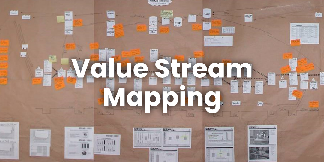
The interesting thing about this brief history of VSM is that some in the Lean community believe the value of VSM is overblown and that it distracts from getting kaizen done. One reason why VSM is sometimes seen as a disappointment is that it is often drawn as an approximation missing important details. Like this:

The incomplete VSM above is most notably missing:
- Cycle and process times across the bottom
- Clearly labeled data flows
You can see how the MIFC is very detailed. In that sense, it’s not just a way to plan for improvements (for example, planning for kanban), it’s also a learning tool. Just like the “chalk circle” (standing in one spot on the shop floor for hours in order to get a deep understanding of waste) is a training and mind-opening tool, the MIFC forces you to pay attention to details, because kaizen is about the details.
The other problem that is sometimes blamed on a VSM fad is a kind of analysis-paralysis. It’s true that there are instances of an organization kicking off a Lean initiative with a wave of VSMs, only to then get bogged down in the details and never really getting serious about making actual (and sustainable) improvements. After all, planning is good, but the goal of Lean is to actually make improvements. I would say that there is more risk for a business to go the Lean journey without a VSM than with one. The key is to realize that using a VSM only the P (Plan) in a PDCA cycle, and therefore only has value if the cycle is fully completed. In this blog, we’ll explore how to make that happen.
How to use a value stream map
The VSM is a very powerful tool for planning. Hence, it’s meant to be used to map the current state (which technically, is what the VSM represents) and the future state (which is normally referred to as Value Stream Design or VSD). Here’s how it could be incorporated in a standard work routine for Lean.
- Identify the major value streams. A value stream is more than a collection of activities; it’s better described as a system. Think of a value stream as a self-contained system of people, materials, equipment, information, and methods that can transform raw materials into finished goods or services. A value stream is normally defined by the set of products or services that flow through it.
- Each value stream will have a cadence of planning events that will produce detailed Continuous Improvement plans, usually at an annual pace.
- The planning events — called Value Stream Planning — are two to three days long. They bring together the key stakeholders: production, scheduling, engineering, sales, maintenance, quality and others.
- Day one is focused on building and analyzing the current state, with a VSM. It’s important to perform a “genba walk,” which is where you see the value creation with your own eyes. If the team has never mapped a given value stream before, they might need a good half day to collect the data. If they’ve already done a similar activity the year before, they’ll have time to also perform some studies to better understand the issues and opportunities (see the summaries placed at the bottom of the map in figure 3). The key part of the day is when the whole team comes to a consensus about the major problems and opportunities.
- Day two is the creation of a future state. If one doesn’t already exist, the team should start by drawing a map of the “Ideal State”. This long-term VSD incorporates all the Lean principles. It’s important to draw this map with the same level of detail as exists in the VSM: what are the goals for inventory counts, cycle times, crewing, changeover times, modes of transportation? This “Ideal VSD” will provide a reference for the team as they get to work on the “Target VSD,” which is the vision for what should be achieved 12 months from now. Again, going into the details will pay off.
- Day two ends with a gap analysis: what needs to happen for the target state to become reality? From this, a list of projects is drawn up.
- Day three consists of prioritizing and selecting the projects. The team may realize they’ve been too ambitious (or not enough) in their Target VSD and will therefore try to resolve the conflicts. Once the list is finalized, it’s sequenced and scheduled, and owners are identified for each project.
- The owners are given the rest of day three to deliver project charters.
- The goals of each project are aggregated, and the value-level goals are agreed. These are typically limited to a single KPI for quality, delivery, human and cost.
- The resulting goals are communicated, and visual management is applied to ensure accountability is managed properly.
A key thing to remember about value stream maps is that they should force you to confront reality. You have to go to the shop floor to count the inventory, measure times, see the waste, etc. When value stream mapping is done as a team, it is enormously helpful in overcoming disagreements because everybody now has a common reference point and they’ve collected the data themselves. Factories and processes are complex systems, and having a map is particularly valuable as a communication tool and starting point for thinking about improvements. It’s why you’re often advised to draw a VSM on a large piece of paper and keep it on your wall where you can refer to it during discussions.